Documentation
After installing this package, there will be a new Customize Editing Interface menu item available in the dashboard. On this page you will find the custom settings for the add-on.
Dashboard > System & Settings > Basics > Customize Editing Interface
Custom Settings
By default this add-on is disabled. By enabling it, you get access to the custom settings. Custom Settings can be disabled or enabled at any time.
Reset to Add-on Default Settings
Resetting will load the default settings that come with the add-on. This is useful if you've experimented and don't like the changes you've made.
Basic Options:
Presets
The quickest way to get started is using a preset. 5.7 Enhanced makes a few changes to text contrast, outlines, hover backgrounds, and block icon rows. 5.6 Retro offers a look similar to concrete5 version 5.6. Using a preset will disable other settings.
* After choosing a preset and saving, the preset can be set to "No Preset". This preserves the preset settings, but allows for further customizing.
5.7 Enhanced
- Add Content Block Icons Per Row - 3
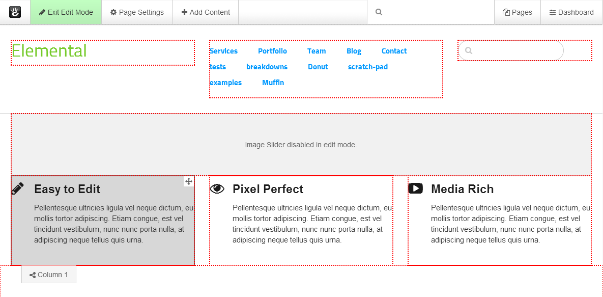
- Always show area outlines while in edit mode
- Show block and empty area background hover color
- WCAG 2.0 compliant color contrast
- Block Outline Width - 2px
- Area Outline Width - 2px

5.6 Retro
- Add Content Block Icons Per Row - 3
- Always show block outlines while in edit mode
- Show block and empty area background hover color
- WCAG 2.0 compliant color contrast
- Block Outline Style - Dotted
- Area Outline Style - Dotted
- Block Outline Width - 2px
- Area Outline Width - 2px

Add Content Block Icons Per Row
This sets the number of horizontal block icons per row in the Add Content Blocks panel. The default is 2 rows.
1 row
* When using the 1 row setting, dragged blocks will be larger than the default. Instead of a square, they will be rectangular and will not have an icon image.

3 Rows

4 Rows

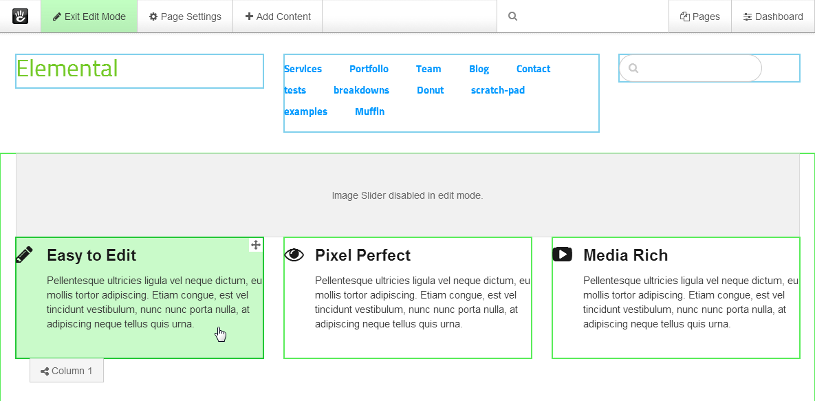
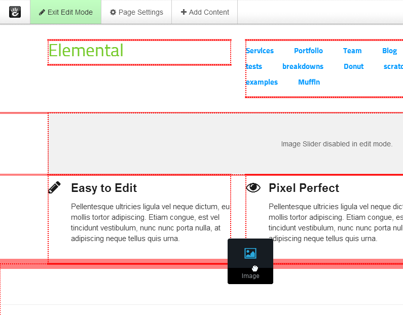
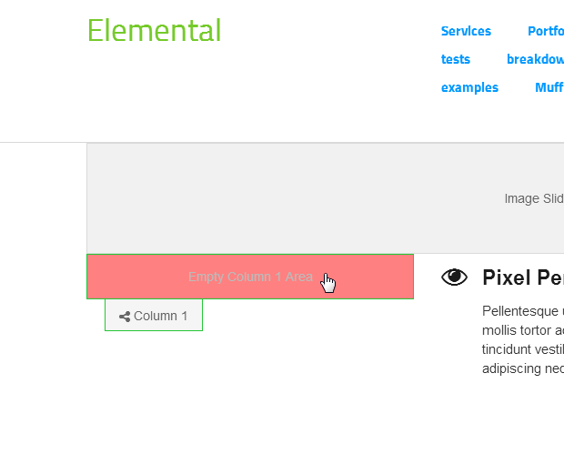
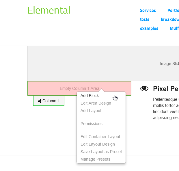
Always show area names while in edit mode
This will always show area name tabs while in edit mode. For best results, use with "Always show area outlines while in edit mode". The tabs will always be on top of everything else on the page.
* Showing persistent area name tabs is not recommended for layouts that have many short tightly packed blocks and areas. The tabs may block or overlap content, blocks, other area name tabs, or areas underneath.

* this example uses "Always show area names while in edit mode" and "Always show area outlines while in edit mode"
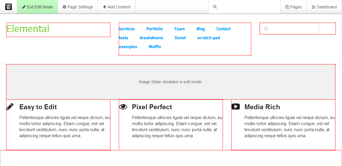
Always show block outlines while in edit mode
This will always show block outlines while in edit mode, even when blocks aren't hovered.

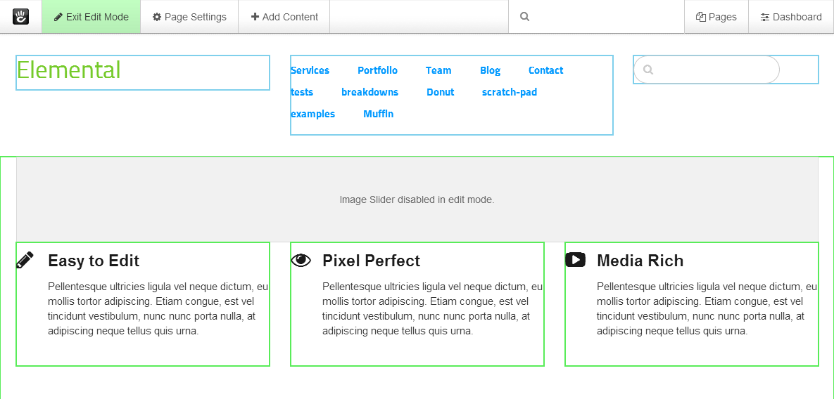
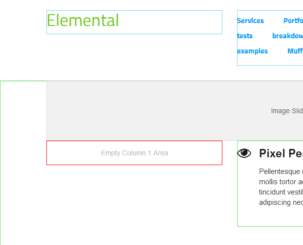
Always show area outlines while in edit mode
This will always show area outlines while in edit mode, even when blocks and areas aren't hovered.

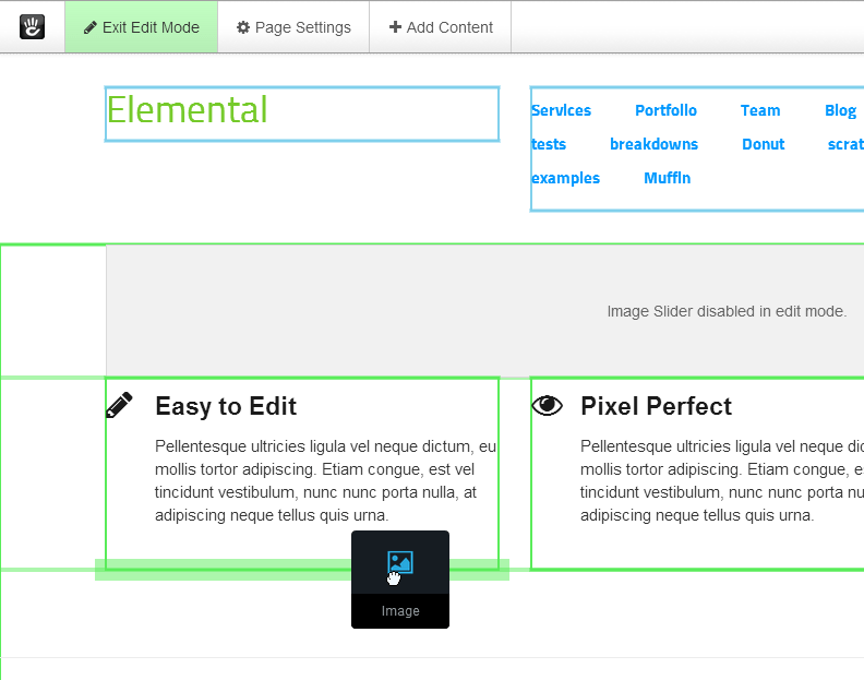
Show block and empty area background hover color
This will give blocks and empty areas a background color when they are hovered.


WCAG 2.0 compliant color contrast
WCAG 2.0 compliant color contrast makes text and icons easier to read for people with visual impairments or if you are using a low contrast device. This will change the editing tool bar, Add Content panels, and Page Settings panels.


Outline Styles and Colors:
Block Outline Style
Choose between dashed, dotted, and solid for the block outlines style. The default style is solid.
Dashed

Dotted

Solid

Area Outline Style
Choose between dashed, dotted, and solid for the area outlines style. The default style is solid.
Dashed

Dotted

Solid

Block Outline Width
Choose the outline width of block outlines. The default width is 1px.
1px
2px

3px

4px

Area Outline Width
Choose the outline width of area outlines. The default width is 1px.
1px
2px

3px

4px

Area Blocks Outline Color
This is the color of area block outlines when "Always show block outlines while in edit mode" is checked.

Area Blocks Outline Hover and Selected Color
This is the hover and selected color of area block outlines.

Global Area Blocks Outline Color
This is the color of global area block outlines when "Always show block outlines while in edit mode" is checked.

Global Area Blocks Outline Hover and Selected Color
This is the hover and selected color of global area block outlines.

Areas Outline Color
This is the color of area outlines when "Always show area outlines while in edit mode" is checked.

Areas Drag Indicator Color
This is the drag indicator color for areas. The drag indicators show where blocks can be added.

Global Areas Outline Color
This is the color of global area outlines when "Always show area outlines while in edit mode" is checked.

Global Areas Drag Indicator Color
This is the drag indicator color for global areas. The drag indicators show where blocks can be added.

Empty Areas Outline Color
This is the color of empty area outlines when "Always show area outlines while in edit mode" is checked.
Empty Areas Outline Hover and Selected Color
This is the hover and selected color of empty area outlines.

Empty Global Areas Outline Color
This is the color of empty global area outlines when "Always show area outlines while in edit mode" is checked.

Empty Global Areas Outline Hover and Selected Color
This is the hover and selected color of empty global area outlines.

Background Colors:
Area Blocks Background Hover Color
This is the background hover color of area blocks when "Show block and empty area background hover color" is checked.

Area Blocks Selected Background Color
This is the selected background color of area blocks.

Global Area Blocks Background Hover Color
This is the background hover color of global area blocks when "Show block and empty area background hover color" is checked.

Global Area Blocks Selected Background Color
This is the selected background color of global area blocks.

Empty Areas Background Hover Color
This is the background hover color of empty areas when "Show block and empty area background hover color" is checked.
Empty Areas Selected Background Color
This is the selected background color of empty areas.
Empty Global Areas Background Hover Color
This is the background hover color of empty global areas when "Show block and empty area background hover color" is checked.

Empty Global Areas Selected Background Color
This is the selected background color of empty global areas.

Export Settings
The Export Settings page can be found under the Customize Editing Interface page.
Dashboard > System & Settings > Basics > Customize Editing Interface > Export Settings
Once you've found the custom settings that you like, you can back them up to use later. Backing up the settings is a one click process, just click the blue "Export Settings" button and download the settings file to your computer. The settings file is in the CSV format and will include the date that it was created on.
Import Settings
The Import Settings page can be found under the Customize Editing Interface page.
Dashboard > System & Settings > Basics > Customize Editing Interface > Import Settings
To restore a settings backup, click the "Choose file" button, and browse your computer for the settings file. The settings file will start with "customize_editing_interface_settings_" and the date it was created on (customize_editing_interface_settings_MM-DD-YYYY.csv). After selecting the file, click the "Upload" button.
* After uploading, there will be a copy of the settings file available in the file manager. The add-on doesn't require this copy, so it can be safely deleted if you have a backup on your computer.
Settings Behavior
These styles apply if "Custom Settings" is enabled:
- Block Outline Width - for hover and select outlines
- Area Blocks Outline Hover and Selected Color
- Global Area Blocks Outline Hover and Selected Color
- Empty Areas Outline Hover and Selected Color
- Empty Global Areas Outline Hover and Selected Color
- Areas Drag Indicator Color
- Global Areas Drag Indicator Color
- Area Blocks Selected Background Color
- Global Area Blocks Selected Background Color
- Empty Areas Selected Background Color
- Empty Global Areas Selected Background Color
These styles apply if "Custom Settings" is enabled and "Always show block outlines while in edit mode" is checked:
- Block Outline Style
- Block Outline Width - for hover, select, and default outlines
- Areas Blocks Outline Color - default outlines
- Global Area Blocks Outline Color - default outlines
* block outlines will lay on top of area outlines
* the default block outline color is on top of the hover and selected color, so they will not be visible if the default outline style is solid
These styles apply if "Custom Settings" is enabled and "Always show area outlines while in edit mode" is checked:
- Area Outline Style
- Area Outline Width
- Areas Outline Color
- Global Areas Outline Color
- Empty Areas Outline Color
- Empty Global Areas Outline Color
These styles apply if "Custom Settings" is enabled and "Show block and empty area background hover color" is checked:
- Area Blocks Background Hover Color
- Global Area Blocks Background Hover Color
- Empty Areas Background Hover Color
- Empty Global Areas Background Hover Color
These styles apply if "Custom Settings" is enabled and "Enable WCAG 2.0 compliant color contrast" is checked:
- WCAG 2.0 compliant color contrast