Documentation
Please also refer to the Live Demo.
The sections below refer to the 3 tabs of the block.
Underlying Image
This is an image that shows up when the gallery loads. If you do not use this, the first overlay image will be shown when the gallery loads.

Underlying image set is optional. You may leave both fields blank. However if you have entered a caption, an image must also be selected.
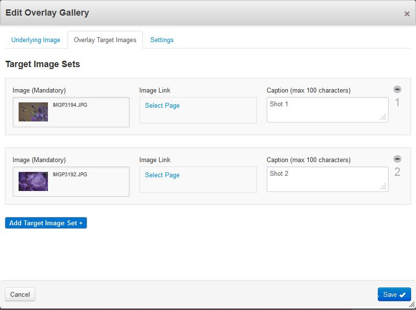
Overlay Target Images
These images are the actual gallery images that correspond to each of the mouseover target areas. The mouseover target areas are automatically generated based on these overlay images and the overlay rows (in Settings tab).
Settings

Transition Effect: Select from 9 different slide transition effects.
Overlay Target Area Style: Select a style for overlay target areas. There are options such as dotted line, solid line, dashed line, link icon and none. If you want a different target area style, you can customise by modifying the CSS.
Gallery Width: Enter 0 for auto width. You may also enter a custom width.
Overlay Rows: This creates the mouseover target areas. Entering "1" creates mouseover areas all packed in a single row. Entering "2" generates mouseover areas in 2 rows. Live Demo examples 1-10 clearly demonstrates how to use this to create mouseover areas.
Mouseout Action: You can choose to either show the first image or keep displaying the current active image.
Transition Speed: Slide transition speed in milliseconds.
Activate Auto Slideshow: Activate/deactive auto slideshow.
Highlight the active slide during auto slideshow: If checked, this will highlight the active slide.
Auto Slideshow Timeout: Delay between slides during auto slideshow.