
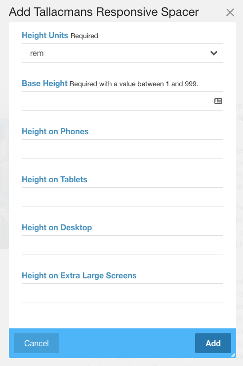
This spacer really makes sense, because it behaves responsive, as you need it in practice. Custom spacer heights can…
okapi
This spacer block does what no other can do!
This block is self-contained and will function with any theme or framework. The 5 breakpoints have been adopted from Bootstrap 4.2.1.
While the interface will say "Phone" or "Tablet" these are general guidelines. It actually checks the pixel width of any given screen and uses that breakpoint.
The breakpoints are:
- greater than 0 -- this will affect all screens obviously
- greater than 576px -- a modern phone in portrait mode
- greater than 768px -- tablets and such
- greater than 992px -- laptops and desktops
- greater than 1200px -- a large monitor
If you set the smallest breakpoint and fail to set a larger size, the small breakpoint will affect EVERY screen size. It cascades upward.
So if you want a set space on every screen just set the smallest setting and the rest will inherit that setting.
This block offers a choice of 3 measurement units for your setting: rems, pixels, and vw or viewport width fractions.
The VW setting will decrease its height in relationship to the screen width the page is viewed on. What this means is that now you can attain realistic spacing on huge monitors as well as the smartphone screen.