WARNING: concrete5 5.6 and earlier are end-of-life. Sales from the marketplace have now ended. Click here to learn more about this transition.
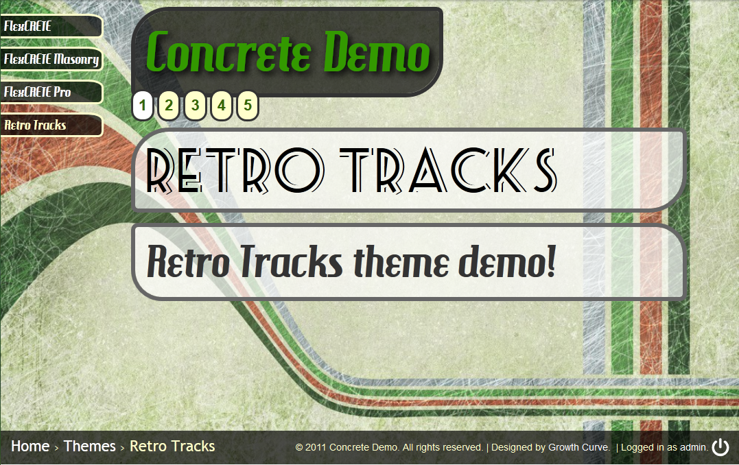
Retro Tracks
developed by PineCreativeLabs
PineCreativeLabs
This Theme is Now Retired, and is no longer supported or available for download or sale.
================================================
This horizontal scrolling theme written in HTML5 is sure to make your project stand out! Ideal for tablet devices and standard or widescreen screen sizes!
FEATURES
- Written in HTML5 / CSS3 and built on the FlexCRETE framework
- Fixed Position Navigation Menu (shows current level pages)
- Easily navigate to other sections within page (with easing effect)
- @Font-Face integration
- Choose your own background image (page attribute)
- Background image auto-fits within window
- Unique CSS3 styling on forms
- Replace logo with your own content
- Every page automatically shows page title and meta description
- Vertical scrolling support for content sections (using jScroll)
- Fixed position footer with breadcrumb navigation
IDEAL FOR
- Step-by-step guides
- Standard informational websites
- Portfolios
- Get creative!
COMPATIBILITY SUPPORT LEVELS
- Small Phones: Poor
- iPhone / Smartphone: Poor
- Small Tablets: Below Average
- iPad / Large Tablets: Average
- Netbooks & Laptops: Average
- Standard Monitors: Excellent
PAGE TYPE BREAKDOWN
Although all page types have the same basic layout, there are some differences between them.
- Full width: 5 sections; header, followed by four main content sections
- Left Sidebar: 4 sections; header, aside (sidebar), main content, additonal content
- Right Sidebar: 4 sections; header, main content, aside (sidebar), additional content
- Blog Entry: 5 sections; header, blog post, aside (sidebar), additional content, additional content
- View and Default: 5 sections, same as 'Full Width'.
-
 Screenshots
 -
 Video
Video
-
 Live Demo
-
 Used On Sites
Approved by PRB
Our 30 Day Support Policy
- None, I'm busy.
Support Hosted
- On marketplace.concretecms.com